One Access. Total Control.
Project Summary
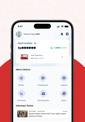
AKSes KSEI is the official app for monitoring Indonesian capital market portfolios. This project redesigns its interface to fix a 15-second login delay, hidden hamburger menus, and blank error screens while maintaining public data privacy. By implementing automatic biometric login, a standard bottom navigation bar, and clear error states, the new design reduces login time to under 3 seconds and simplifies asset tracking.
Discover
Output
Define
Output
Develop
Output
Deliver
Output
Designing Within Fintech Constraints
Balancing regulatory data with modern user experience.
Redesigning a central depository app meant dealing with complex financial data structures. We identified three core challenges to address.
Data Fragmentation
Users hold assets across multiple securities (Stocks, Mutual Funds). The challenge was to consolidate this into one simple number without losing detail.
Privacy & Security
Financial apps are often opened in public, We needed a way to protect sensitive balance information without hindering the UX.
Visual Trust
The legacy design felt outdated and bureaucratic. The new design had to feel modern and premium to build investor confidence.
Learning What Isn't Working for Our Users
Analyzing the current state of the application.
Through heuristic evaluation and competitive benchmarking, we found three major friction points for users.
High Interaction Cost
Users faced a 15-second login delay due to missing biometric auto-triggers. This friction discouraged frequent portfolio monitoring.
Silent Errors
System errors or empty data often resulted in a blank screen without explanation, causing panic about asset safety.
Hidden Navigation
Vital features were buried inside a Hamburger Menu, forcing users to guess where to find essential tools like Portfolio or News.

The Concept: Frictionless Flow
Shifting from System-Centric to User-Centric.
We realized that barriers weren't just visual, but functional. The solution was to build a Reactive Ecosystem that prioritizes Instant Biometric Entry (< 3s login) and replaces silent errors with Transparent Feedback to build immediate trust.
Structuring Discovery
Iterating on Information Architecture.
We dismantled the hidden Hamburger Menu that confused users. Critical features were surfaced into a modern Bottom Navigation Bar, ensuring users can access vital tools like Portfolio and News with a single tap.
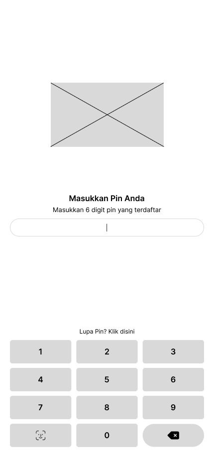
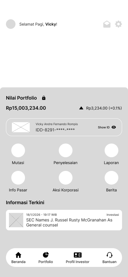
We also designed a comprehensive State Handler System (Empty States) to guide users clearly when data is unavailable.
The Result: A Trustworthy Ecosystem
A complete overhaul of the investing experience.
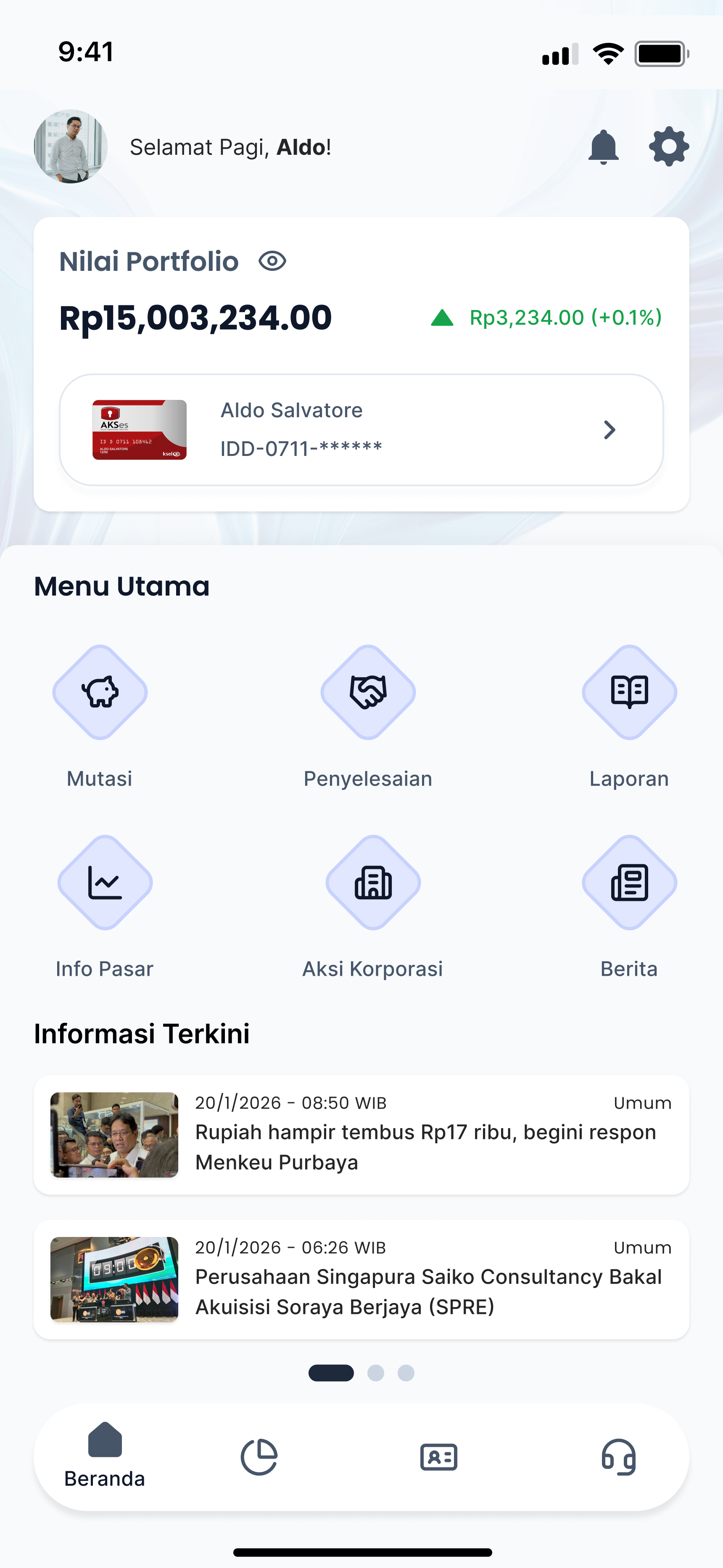
Before vs After
 New Design
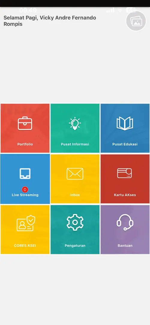 Legacy App
The final high-fidelity design introduces key features that solve the initial pain points:
Frictionless Entry
Implemented Auto-Trigger Face ID to slash login time from 15s to < 3s, removing the barrier to daily portfolio checks.
Transparent Feedback
Replaced blank screens with Contextual Illustrations and specific error messages, turning user panic into clarity and trust.
Intuitive Discovery
Relocated critical tools from the hidden hamburger menu to a Bottom Navigation Bar, ensuring one-tap access to vital features.
